Amazon A+ Content Examples and Tips: Make the Page Easier to Buy
The FBA Guys
May 19, 2026
A product page can look expensive and still leave the buyer guessing.
That is where Amazon A+ Content gets interesting. The obvious use is prettier product-detail-page real estate: bigger images, better text blocks, comparison charts, maybe a Brand Story carousel if the brand has one. The better use is narrower. Amazon A+ Content examples and tips should make the product easier to understand, easier to compare, and easier to trust before the shopper starts hunting through reviews for the answer you should have given them.
As of the writing of this article, Amazon describes A+ Content as enhanced product-page content with images, video, customized text placements, shoppable comparison charts, Brand Story modules, and related formats. Amazon also says Basic A+ Content can increase sales by up to 8%, while well-implemented Premium A+ Content can increase sales by up to 20%, based on Amazon internal data.
The phrase doing the work there is "well-implemented."
We should be careful with the data. The FBA Guys valuation database doesn't track A+ Content usage, module count, conversion rate, or whether a page used a lifestyle photo with a golden retriever and a suspiciously clean kitchen counter. What it does show is the business context around good A+ Content: Brand Registry, product uniqueness, review depth, SKU breadth, product design, and documentation discipline.
Those signals point to a pretty simple thesis. A+ Content works best when it explains something real about the product or the brand. It works poorly when it decorates a commodity.
What Amazon A+ Content Is Actually Supposed to Do
A+ Content sits below the main listing content and gives you more room to explain the product. Basic A+ Content can include text, images, logos, comparison charts, and specification tables. Premium A+ Content adds larger images, video, interactive hotspots, carousels, Q&A modules, and richer comparison options.
That sounds like a design brief. It is really a comprehension brief.
The customer already saw the title, main image, bullets, price, reviews, and delivery promise before they reached the A+ section. By the time they scroll, they are usually trying to resolve a more specific question. Will this fit? Is this the right model? Why does this cost more? What comes in the box? Is the brand legitimate, or did someone stitch together a logo in Canva at 11:43 p.m.?
Of course, some shoppers never scroll. Fine. The page still needs to serve the ones who do, because those are often the shoppers who are hesitating with their thumb over the back button.
Amazon's own guidance lines up with that idea. Its A+ Content design guide recommends concise copy, professional product and lifestyle photos, technical specifications, comparison charts, and Brand Story. It also warns against embedding too much text in images because mobile resizing can make the details hard to read.
Tiny type inside a beautiful image is still tiny type. We shouldn't have to say this. We do.
What Our Valuation Data Can and Can't Say About A+ Content
The first version of this brief wanted to make A+ Content a clean conversion-rate article. The database wouldn't let us.
That is the useful scar in this topic. We can talk about Amazon's published A+ Content claims. We can talk about module strategy. We can talk about what strong pages tend to clarify. But we can't pretend our valuation database knows whether a seller used a Brand Story module, a Premium carousel, or a comparison chart with three awkwardly cropped thumbnails.
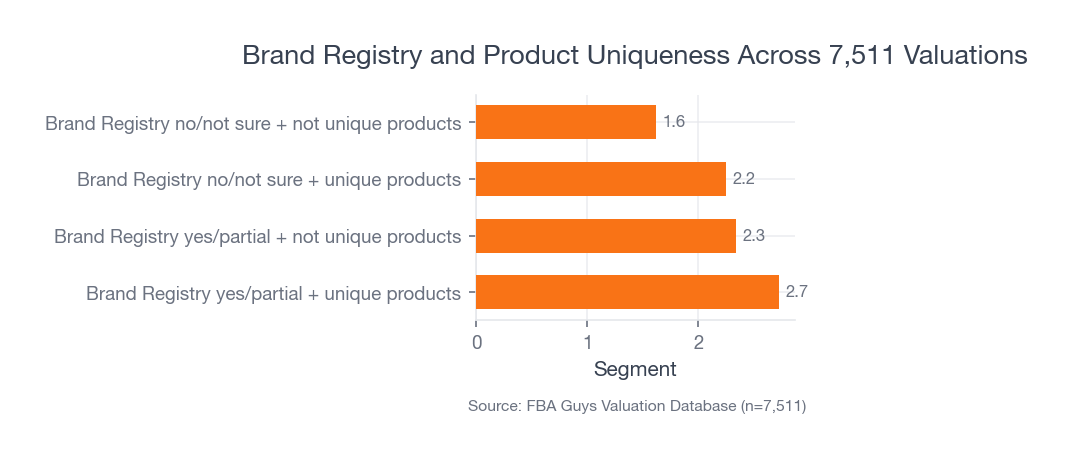
What we can see is more durable. Among 7,511 valuations with usable Brand Registry and product-uniqueness data, businesses with Brand Registry yes/partial plus unique products averaged 2.73 derived value-to-SDE. Brand Registry yes/partial plus not-unique products averaged 2.34. Businesses without clear Brand Registry and without unique products averaged 1.62.
 Source: FBA Guys Valuation Database (n=7,511)
Derived value-to-SDE is a valuation context measure, not a public market multiple. We calculate it as valuation divided by derived seller's discretionary earnings, where SDE is gross profit minus operating expenses.
The interpretation matters more than the formula. Brand Registry by itself isn't magic. Product uniqueness by itself isn't enough either. The strongest pattern appears where the brand has something ownable and the product has something worth explaining. That is the same basic risk logic behind what makes a valuable Amazon FBA business.
That is exactly where A+ Content earns its space.
Amazon A+ Content Examples That Work
The best Amazon A+ Content examples tend to answer one of five buying questions. You can use these as templates, but don't treat them like a design gallery. A gallery makes everything look equally useful. The product page doesn't have that luxury.
Example 1: The Fit and Compatibility Block
Use this when the wrong purchase is easy.
To illustrate: a replacement-filter brand could use a module that shows compatible model numbers, incompatible model numbers, pack quantity, installation steps, and expected replacement timing. The hero image might show the filter in place. The text should be boring in the best possible way.
No poetry. No brand manifesto. Just "fits models X, Y, and Z" in a size a tired person can read on a phone.
This kind of module is especially useful when reviews show confusion around fit, dimensions, included parts, color, size, or setup. You don't need to wait for a returns report to tell you this. Read the three-star reviews. The details are usually sitting there, wearing work boots.
Example 2: The Use-Sequence Module
Use this when the product needs a little confidence before purchase.
A cleaning tool, supplement organizer, camping accessory, baby product, or kitchen device often benefits from a three-step visual sequence: open it, use it, clean it, store it. The job isn't to make the product look heroic. The job is to remove the small uncertainty that stops the purchase.
This is where sellers tend to get a little too glossy. A lifestyle image can help, but a lifestyle image with no operating information is just mood. The customer doesn't need a picnic. They need to know whether the lid leaks when the container is sideways in a backpack.
Example 3: The Comparison Chart
Use this when you have multiple products that a sane person might confuse.
Amazon's Basic and Premium A+ Content both support comparison charts. Premium comparison charts can also include shoppable features, depending on current eligibility and module availability. The chart should help the customer choose among real alternatives: size, material, capacity, use case, compatibility, warranty, included accessories, or price tier.
Keep the rows honest. If every product gets the same checkmark in every row, you made a decoration, not a comparison.
Example 4: The Brand Story That Explains the Product Line
Use this when the brand has a reason to exist beyond "we found a supplier."
Brand Story can work well when it explains the brand's point of view, connects product lines, or gives the customer a reason to trust the company behind the product. It gets mushy when it turns into founder cosplay. A paragraph about passion for quality doesn't carry much weight if the page never explains the material, testing process, sourcing standard, or problem the product solves.
The fact is, customers have become quite good at ignoring brand adjectives.
If the brand story can point to something specific, use it. If it can't, spend the module on product education.
Example 5: The Objection-Handling Module
Use this when the product has one friction point that keeps showing up.
Maybe the item looks smaller than expected. Maybe assembly takes 11 minutes and one part looks backward until it clicks into place. Maybe the premium version costs more because the hinge is metal instead of plastic. A strong A+ module can handle that before the customer reaches the review section and finds someone else explaining it less generously.
This is the messy detail A+ Content is good at: the small thing that doesn't fit neatly in a bullet, but changes how the product feels once it arrives.
Amazon A+ Content Tips for Product Detail Pages
Start with the questions already visible on the page.
Reviews, Q&A, return reasons, support emails, and competitor pages will usually tell you which modules deserve the space. If customers ask about sizing, build a sizing module. If they compare two models, build a comparison chart. If the product's value depends on material or construction, show the construction. If the brand has a family of related SKUs, map the family.
Here is a practical order:
- Clarify the product's main use case.
- Show the product in context.
- Explain fit, size, ingredients, materials, or compatibility.
- Compare related models only when comparison helps.
- Use Brand Story only when it adds trust or catalog context.
- Test meaningful variants with Amazon's experiment tools where available.
The order matters less than the discipline behind it. Every module should have a job.
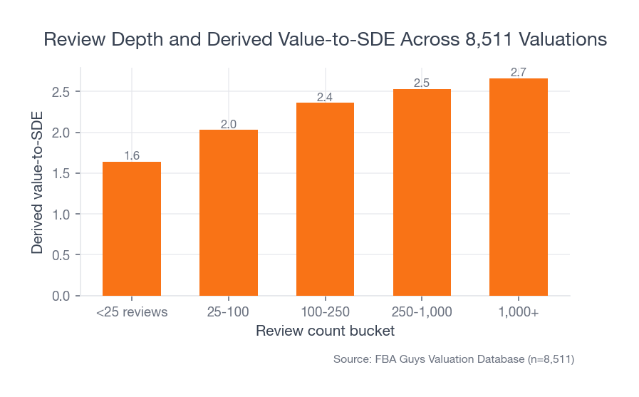
Review depth gives useful context here. In our database, businesses with fewer than 25 reviews averaged 1.64 derived value-to-SDE. The 25-100 review group averaged 2.03. The 100-250 group averaged 2.36. The 250-1,000 group averaged 2.53. Businesses with 1,000+ reviews averaged 2.66.
 Source: FBA Guys Valuation Database (n=8,511)
That chart isn't telling you reviews cause valuation outcomes. It is telling you trust accumulates in layers, and the product page is one of the places those layers either reinforce each other or fight.
A+ Content can't replace reviews. It can reduce the number of questions a review has to answer.
How to Use Comparison Charts Without Making a Catalog Dump
Comparison charts are useful when the customer is choosing among siblings. They are awful when the chart becomes a warehouse map.
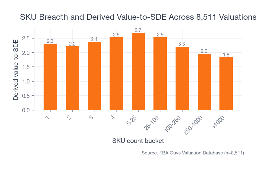
Our SKU data explains why this gets delicate. Businesses with 5-25 SKUs averaged 2.69 derived value-to-SDE across 2,856 valuations. Single-SKU businesses averaged 2.31. Businesses with 250-1,000 SKUs averaged 1.96, and those with more than 1,000 SKUs averaged 1.84.
 Source: FBA Guys Valuation Database (n=8,511)
The middle range is interesting. There are enough products to create meaningful choice, but not so many that the catalog becomes hard to explain. That is the sweet spot for A+ comparison charts.
For a five-product line, a chart can clarify:
- Beginner vs advanced model
- Small vs medium vs large
- Indoor vs outdoor use
- Compatible accessories
- Good, better, best tiers
- Refill or replacement timing
For a 900-SKU catalog, the same module can become a wall of almost-identical boxes. At that point, the comparison chart may need to compare product families rather than individual SKUs. Or perhaps it shouldn't exist on that ASIN at all.
There is a quiet operational lesson here. If you can't explain the catalog simply in A+ Content, your catalog may be hard for a buyer, a VA, a warehouse team, and a future owner to understand too. Catalog clarity is one of those operating signals that sits next to the Amazon FBA KPIs worth tracking weekly.
Where Brand Story Helps, and Where It Gets Mushy
Brand Story is strongest when it connects product logic across the catalog.
That could mean the origin of a material choice. It could mean why the company makes refills, replacement parts, and accessories. It could mean the brand's design standard, safety standard, or audience. It could also mean showing the customer where to go next in the product family.
What doesn't help much is a soft paragraph about caring deeply.
The product page has limited patience for sentiment. If your brand began because you were frustrated with a real problem, show the problem and the design response. If the product line supports a particular use case, map that use case. If the brand has a certification, warranty, ingredient standard, or testing process, put that where a customer can inspect it.
Product design data makes this point louder than expected. Designed-in-house products averaged 2.91 derived value-to-SDE across 2,187 valuations. Reseller products averaged 1.54 across 1,465.
That gap doesn't belong entirely to content. Of course it doesn't. Designed products can have stronger margins, defensibility, and customer attachment. Still, it changes how we think about A+ Content. The more real design work behind the product, the more useful the content can become.
There is more to say.
How to Test A+ Content Instead of Guessing
Amazon's Manage Your Experiments can test listing content, including A+ Content and Brand Story, for eligible Brand Registry sellers. Amazon says experiments can report units sold, sales, conversion rate, units sold per unique visitor, sample size, and projected one-year impact.
That is better than arguing over which image "feels premium."
Test changes that represent a real hypothesis. A different background color is rarely the right first test. Try a clearer comparison chart, a stronger compatibility module, a technical-specification block, a different opening image, or a Brand Story that points to product-line logic instead of mood.
A good experiment question sounds like this:
- Does a fit-focused module reduce hesitation on compatibility-heavy ASINs?
- Does a comparison chart move buyers toward the right model?
- Does a technical-specification module improve conversion on products with dimension-sensitive use cases?
- Does Brand Story help when the brand has repeat-purchase or accessory logic?
One test won't make the business knowable. Several tests, run against the recurring questions in your page data, will teach you more than a design opinion thread ever will.
What A+ Content Means for the Business You Are Building
A+ Content is customer-facing documentation.
That may sound too plain for a marketing asset, but it fits the data. Businesses with comprehensive SOP documentation averaged 3.00 derived value-to-SDE in the smaller documentation subset we analyzed. Businesses with no SOPs averaged 2.45. The sample is much smaller than our Brand Registry and review-count cuts, so we shouldn't overstate it. Still, the direction is familiar.
Businesses become easier to trust when the operating logic is documented.
A+ Content does a related job on the front end. It documents what the product is, who it is for, how it works, how it compares, and why the brand exists. A future buyer looking at the business may not price the A+ modules as a standalone asset. They will care whether the product line is understandable, defensible, and transferable, which is why buyer risk review starts long before anyone argues about the listing design.
The connection is indirect, but it isn't imaginary.
If your product requires founder explanation to make sense, that explanation needs to move somewhere durable. Some of it belongs in SOPs. Some belongs in customer-service macros. Some belongs in onboarding docs for agencies or VAs. Some belongs on the product detail page itself.
A+ Content is one of those places.
FAQ
What is Amazon A+ Content?
Amazon A+ Content is enhanced product-detail-page content that lets eligible sellers add richer images, text placements, comparison charts, Brand Story modules, and in some cases video or interactive Premium modules. Its job is to help customers understand the product before they buy.
Who can use Amazon A+ Content?
As of the writing of this article, Amazon says sellers need a Professional selling account and the proper Brand Registry role for a registered brand, or eligible generic products in the catalog. Premium A+ Content has additional eligibility requirements, so check Seller Central before planning a Premium layout.
What are good Amazon A+ Content examples?
Good examples usually answer a buying question: compatibility, sizing, how to use the product, which model to choose, why the material matters, what comes in the box, or how the brand's product line fits together. Pretty modules that don't answer anything tend to age badly.
How many Basic A+ Content modules can you use?
Amazon's current design guide says Basic A+ Content can use up to five modules per ASIN. Treat that as current platform guidance, not a permanent rule. Amazon can change module availability, eligibility, and layout options.
Should every ASIN use the same A+ Content?
No. Shared brand modules can create consistency, but product-specific modules should answer product-specific questions. A size-sensitive ASIN needs different help than a giftable accessory, a technical replacement part, or a premium bundle.
Does A+ Content increase the value of an Amazon FBA business?
The FBA Guys database doesn't prove that A+ Content directly increases business value. It does show stronger valuation context around Brand Registry, product uniqueness, review depth, SKU clarity, and documentation. A+ Content can support those signals when it makes the product line easier to understand and trust. For the broader pricing frame, use the Amazon FBA business valuation model.
The Page Has to Earn the Scroll
Amazon A+ Content examples and tips can get strangely aesthetic, as if the page wins by looking more polished than the next product in the carousel.
Polish helps. Clarity helps more.
Use A+ Content to answer the question the customer is already carrying. Show fit. Show scale. Show the difference between models. Explain the material. Make the Brand Story specific. Test the parts that matter. Keep the mobile shopper in mind, because that tiny text block inside your beautiful image isn't getting any larger just because the brand deck looked nice on a 27-inch monitor.
The strongest A+ Content doesn't try to make an ordinary product feel important. It makes a real product easier to buy.
Curious what your business is worth?
Get a free, instant valuation and see how your Amazon business stacks up.
Get Your Free Valuation