Amazon Main Image Requirements and Best Practices: The Thumbnail Has to Do More Than Pass Review
The FBA Guys
May 18, 2026

The smallest picture on your listing may be doing the most public work.
Your Amazon main image appears in search, on the detail page, in recommendations, and anywhere Amazon needs one clean visual to represent the product. It has a compliance job first. As of the writing of this article, Amazon expects the MAIN image to show the product on a white background, fill the frame, and avoid text, logos, borders, color blocks, watermarks, or other graphics.
That rule set is visible. The business problem is quieter.
The main image has to make the product legible before anyone has read the title, price, reviews, or bullet points. If the thumbnail needs too much explanation, the rest of the listing starts from behind. A white background and a clean crop won't build a brand by themselves, of course. They remove the first bit of confusion.
Among 8,508 successful valuation records in the FBA Guys database, we don't have a field for image quality. We do have fields for things that sit nearby: Brand Registry, review depth, product uniqueness, SKU count, and product concentration. Those signals tell a useful story. The strongest businesses tend to make the product easier to understand and easier to defend.
The main image is where that work first becomes visible.
What Amazon Requires for the MAIN Image
Amazon's MAIN image rules are stricter than the rules for secondary images because the MAIN image becomes the default image across Amazon surfaces. Amazon's product photography guidance says every product must have at least one image and recommends providing at least six images. It also points sellers back to Seller Central's technical and content requirements for images.
At minimum, your main image should:
- Show the actual product for sale.
- Use a pure white background.
- Have the product fill at least 85% of the image area.
- Avoid text, logos, watermarks, borders, badges, color blocks, and graphics.
- Show only what the customer receives.
- Show the product outside of packaging unless the packaging is an important product feature.
- Be clear, sharp, and free of pixelation or jagged edges.
- Use an accepted file type such as JPEG, TIFF, PNG, or non-animated GIF. Amazon's product photography guidance also lists a 500 to 10,000 pixel range on the longest side, which is a wide technical range but a narrow practical one if the image has to survive zoom and customer inspection.
The practical version is simpler: no decoration, no cleverness, no little orange "BPA free" badge floating in the corner.
Save the infographics for the secondary images.
External reference: Amazon's product photos guide and Amazon Seller Central product image quick tip.
The 85% Rule Is Really About Recognition
The 85% rule is usually treated as a crop instruction. That is true, but thin.
A product that fills the frame is easier to recognize at thumbnail size. A product that floats in a large white square asks the shopper to work. That extra half-second matters when your image is sitting next to ten similar offers, three sponsored products, and a competitor who cropped the product correctly.
We see a related pattern in SKU data. Businesses with 6-20 SKUs averaged 2.69 derived value-to-SDE in our valuation database. Businesses with 21+ SKUs averaged 2.24. The number doesn't say anything about image compliance directly. It says that complexity needs systems.
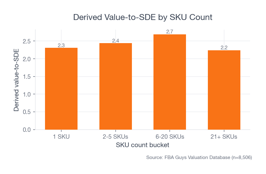 Source: FBA Guys Valuation Database (n=8,506)
Once the catalog gets large, image quality becomes a process question. Can every SKU show the product clearly? Can every variation be identified quickly? Does the customer know whether the bundle includes the cap, the cable, the refill pack, or the nice little stand the photographer added because the frame looked empty?
That last one is where a lot of trouble begins.
Internal link: catalog complexity also shows up in weekly operating metrics, which is why we wrote about Amazon FBA KPIs to track weekly.
White Background, Packaging, Text, and Props
Amazon's white-background rule exists because the image has to blend into the search result. A pure white field also strips away staging tricks.
This is good discipline.
It forces the image to answer the clean question: what am I buying? If the product only looks good when a hand model, a textured table, a plant, and a glowing kitchen window are doing the work, the secondary image stack can handle that. The main image should carry the product on its own.
Packaging deserves special care. Amazon guidance generally expects the MAIN image to show the product outside the packaging. There are exceptions when packaging is part of the product, but a box can create the wrong read quickly. A shopper may think the package is the item, or that the accessories on the box are included.
Text creates the same problem in a louder way. Size callouts, badges, warranty stickers, "new version" labels, promotional bursts, and comparison graphics may help in a secondary image. On the MAIN image, they create policy risk and visual noise.
The fact is, if the product needs a label in the main image to explain why someone should click, the image stack probably hasn't been built carefully enough.
The Business Case Hides in the Nearby Signals
The main image isn't a valuation lever by itself. We shouldn't pretend otherwise.
But it sits in the same family as other signals a serious operator would inspect: product clarity, brand control, proof of demand, and repeatability. In our database, businesses without Brand Registry averaged 1.81 derived value-to-SDE across 2,037 records. Brand Registry-coded businesses generally sat higher, with yes_new businesses averaging 2.66 across 3,009 records.
That doesn't mean Brand Registry caused the difference. It means stronger businesses often carry more control signals at the same time.
There is a second database pattern worth sitting with for a minute. Unique products averaged 2.67 derived value-to-SDE across 4,752 valuations. Products marked not unique averaged 2.07 across 3,756. That gap doesn't give the main image magical powers. It does show why the image has to reveal what is actually different about the product. If the only visible difference is the label, the market can usually feel that.
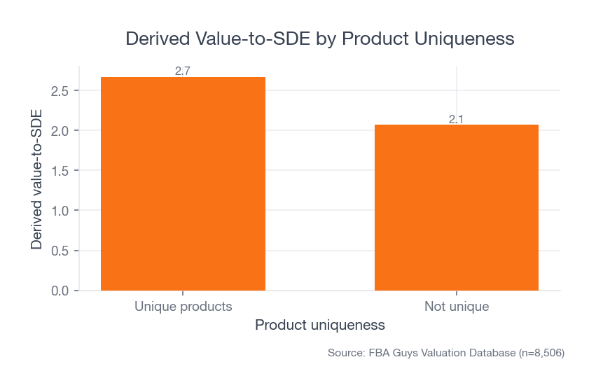 Source: FBA Guys Valuation Database (n=8,506)
Product design tells the same story with a sharper edge. Products designed in-house averaged 2.91 derived value-to-SDE. Reseller products averaged 1.54. Private-label products averaged 2.11. The image doesn't create the custom mold, better material, tighter bundle, or cleaner use case. It has to show those things before the shopper has to read six bullets to understand them.
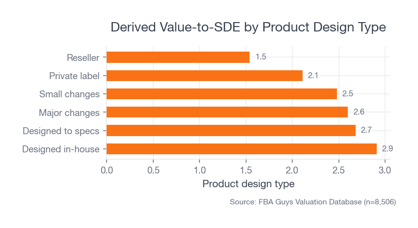 Source: FBA Guys Valuation Database (n=8,506)
The review data says something similar. Businesses with less than 25 reviews averaged 1.62 derived value-to-SDE. Businesses with 2,500+ reviews averaged 2.66. Review score alone was less clean. The 4.5-star group averaged 2.45, while the 5.0-star group averaged 2.31.
That surprised us a bit. Not because five-star products are bad, obviously. It suggests that depth of proof can matter more than the prettier-looking score.
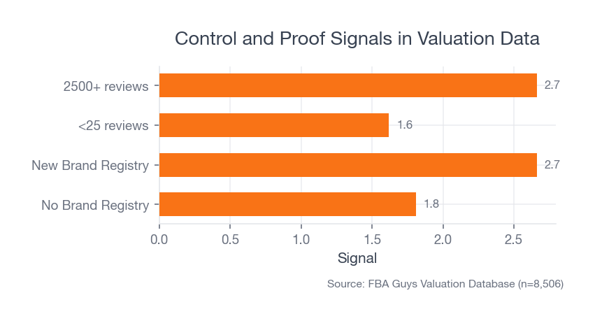 Source: FBA Guys Valuation Database (n=8,506)
The main image can't manufacture that proof. It can make sure the shopper reaches it.
Internal link: this is the same basic reason Amazon FBA business valuation starts with risk, growth, transferability, and documentation rather than one isolated metric.
Where Compliant Images Still Lose
Some main images pass the rule and still feel weak.
They are technically sharp, technically white, and technically free of text. Then the product sits at a slight angle that hides the feature people buy it for. Or the color is accurate in the studio but odd on a phone screen. Or the product is cropped so tightly that the shopper can't tell whether the item is a refill, a full kit, or a replacement part.
This is where the operator's question helps: what has to be obvious before the customer reads a word?
For a kitchen tool, it may be shape and scale. For a supplement, it may be bottle count and package identity. For a replacement part, it may be compatibility, though the compatibility claim itself probably belongs in the title or secondary image rather than as text on the MAIN image. For apparel, it may be silhouette and color accuracy.
Tiny misunderstandings become expensive when they repeat across the catalog. A customer orders the wrong size, leaves a review about "misleading photos," returns the item, and now the listing has to carry a small dent that didn't come from product quality. It came from visual ambiguity.
No one enjoys explaining that in a performance review.
Best Practices That Actually Help
Start by shooting the product as if the thumbnail is the final exam.
The image should still read at a small size. Edges should be obvious. Color should match the real product. The most important feature should face the shopper, unless the product category expects a different orientation.
For bundles, show only what comes in the offer. For variations, make each variation visually distinct enough that a customer doesn't order navy and receive black because the crop hid the difference. For reflective products, keep reflections controlled without turning the item into a plastic-looking render. For white products on white backgrounds, use edge control and shadow discipline so the product doesn't disappear.
One messy detail: white-on-white products often pass the background rule and still fail the shopper. The image is technically clean, but the corner seam, handle edge, or fabric texture vanishes into the frame like someone lowered the opacity to 80%.
That is where compliance and conversion part ways.
Before you hire a photographer or retoucher, write the image brief in product language instead of art language. "Make it premium" doesn't tell anyone what must be visible. "Show the silicone grip, the rounded corner, and the two included replacement blades" does.
The brief should include:
- The exact items included in the offer.
- The product feature that has to be visible at thumbnail size.
- The category-specific image rule you have checked.
- Any color, material, or size detail customers have misunderstood before.
- The variation logic, especially when child ASINs differ only slightly.
This sounds fussy until you have 37 image files named final_main_v3_REAL_FINAL.jpg and no one remembers whether the little brush was included in the bundle.
Build a Repeatable Main-Image Checklist
A single good image is useful. A repeatable image standard is better.
Use a checklist before upload:
- Background is pure white.
- Product fills at least 85% of the image area without cropping important features.
- Only the included product is shown.
- No text, badges, watermarks, borders, logos, or graphics are overlaid.
- Packaging is excluded unless it is a meaningful product feature.
- Image is sharp at full size and still clear as a thumbnail.
- Color looks accurate against the physical product.
- File format and dimensions meet Amazon requirements.
- Variation images clearly distinguish color, size, count, or bundle differences.
- Category-specific style guidance has been checked before upload.
The last point matters. Category rules can add expectations on top of the general image requirements. Apparel, jewelry, home goods, and consumables don't always behave the same way.
Internal link: if you are deciding how much product-photo work a SKU can economically justify, start with the SKU's real contribution economics. The mechanics are covered in Amazon FBA unit economics explained.
Audit the Image Like a Buyer Who Is Moving Too Fast
Your main-image review shouldn't happen only at full desktop size.
Look at it in search results. Look at it on a phone. Look at it beside your closest competitors. Then look at it after stepping away from the screen for ten minutes. The first glance is closer to how the image works in the wild.
Ask five plain questions:
- Can I identify the product immediately?
- Can I tell what is included?
- Can I tell which variation this is?
- Does the image look materially different from competing products?
- Would a reasonable customer feel surprised when the item arrives?
That last question is quite useful. It catches the beautiful image that quietly oversells the offer. The lighting is perfect, the angle is flattering, the prop is attractive, and the customer receives something that feels smaller, flatter, duller, or less complete than the image implied.
It isn't always a policy problem. It is still a business problem.
What to Measure After the Image Goes Live
Once the image is live, don't declare the work finished just because the listing stayed active.
Watch the metrics that tell you whether the thumbnail is pulling its weight. Sessions, click-through rate if you have access to ad or search-term reporting, unit session percentage, return reasons, review language, and customer questions all give you small pieces of the answer. None of those numbers is perfect by itself. Together, they can tell you whether the image is creating clarity or simply passing inspection.
The most useful evidence often comes from irritating places.
A customer asks whether the refill pads are included. A return comment says "smaller than expected." A buyer message asks if the product works with the old model even though the title already says it does. One comment is noise. Four comments with the same confusion are a brief.
This is also where paid traffic can fool you. A main image that performs adequately with heavy couponing, aggressive ads, or a low launch price may look weaker once the listing has to stand on its own. The image didn't change. The amount of help around it did.
You don't need to redesign the image stack every week. You do need a review cadence, especially for high-volume SKUs and products where a small misunderstanding creates returns.
Quarterly is often enough for stable products. Faster if you are launching variations, changing packaging, adding bundle components, or seeing new competitors copy the same thumbnail angle. A main image can be compliant for years and still get stale because the competitive set moved around it.
The Edge Cases Are Where the Policy Gets Real
A rule can look clean until a product refuses to behave. White products on white backgrounds are the obvious example, but they aren't the only one. Transparent products, reflective products, bundles, and variation-heavy catalogs all create small decisions that affect whether the image is both compliant and useful.
Bundles need a plain rule: show exactly what the customer receives. If the offer includes two filters and a brush, show two filters and a brush. If the offer doesn't include the device those filters fit into, keep the device out of the MAIN image. Compatibility can be explained in secondary images and copy. The first image has to keep the offer clean.
Reflective products need controlled lighting. A stainless lid can look premium when the reflection defines the curve. It can also look sloppy when the reflection shows the softbox, the camera, or a gray rectangle that makes the surface look dented. The customer won't know the lighting setup was the problem. They will just know the product looked odd.
Variation images deserve their own discipline. Parent and child images should make color, size, count, and bundle differences visible without forcing the customer to inspect the title like a contract. This isn't exciting work. It is the sort of quiet cleanup that prevents returns, support tickets, and reviews that start with, "I thought I was ordering..."
What Secondary Images Should Do
Secondary images get the jobs the MAIN image isn't allowed to do.
Use them to show scale, use cases, dimensions, texture, packaging, installation, comparison, and what changes when the product is actually in someone's hand. If the main image is the clean ID photo, the secondary stack is the evidence file.
This is where lifestyle photos belong. This is where callouts can help. This is where a product can finally leave the white room. Amazon's listing guidance says sellers can upload up to nine photos, and A+ Content gives eligible sellers more room for enhanced images, comparison charts, video, and brand story.
The sequence should feel deliberate. Main image first for recognition. Then scale. Then use. Then details. Then objections. Then brand proof or support material if it matters.
Of course, some products need a different order. A complicated installation product may need dimensional clarity earlier. A fashion product may need fit and drape. A replenishable consumable may need package count and ingredient confidence.
The image stack should answer the shopper's next question before the shopper has to dig for it.
Check the Image After It Is Live
Pre-upload checks are useful. The live listing is the real test.
Look at the image in search results, not only in the listing editor. Look at it on mobile. Look at it next to sponsored placements. Look at it in the variation selector if variations matter. The same image can feel clear at 2,000 pixels wide and strangely vague when Amazon turns it into a small tile.
Then tie the image back to operating metrics. If sessions are steady and unit session percentage falls after an image change, the image deserves suspicion. If return comments mention size, color, included components, or packaging confusion, the image stack deserves another pass. A main image won't fix a bad product-market fit, but it can create avoidable misunderstanding.
This is why catalog image review belongs near the operating cadence. It doesn't need a weekly redesign meeting. Please don't create one of those. It needs a short, repeatable check when products launch, variations change, packaging changes, or review language starts pointing to expectation gaps. For a broader operating rhythm, see our guide to Amazon FBA KPIs to track weekly.
FAQ
What are Amazon main image requirements?
Amazon main image requirements generally require the product to appear on a white background, fill at least 85% of the image area, accurately represent the product for sale, and avoid text, logos, watermarks, borders, badges, color blocks, and other graphics.
Can my Amazon main image include text?
No. Text belongs in secondary images, A+ Content, or the listing copy. The MAIN image should show the product, not a mini advertisement.
Does the product really need to fill 85% of the frame?
Yes. Amazon states that the product must fill at least 85% of the image. Practically, that rule also helps the product survive thumbnail size.
Are AI-generated product images safe for Amazon main images?
Be careful. The MAIN image has to accurately represent the product for sale. AI cleanup, background removal, and retouching can help, but the final image needs to look like the actual product a customer receives. If the tool invents edges, improves materials, changes proportions, or makes a cheap finish look premium, you have moved from presentation into misrepresentation.
Should I use the supplier's product photo?
Only if it meets Amazon's current requirements and honestly represents your product. Supplier photos are often built for catalogs, not Amazon search results. They may include props, colored backgrounds, packaging, or angles that make sense in a wholesale PDF and fail in the MAIN image slot.
Should the main image show packaging?
Usually no. Amazon guidance says MAIN images should show products outside packaging unless the package is an important product feature. This gets category-specific, so check the relevant Seller Central guidance before upload.
Do better Amazon main images improve valuation?
Not directly in our data. The FBA Guys valuation database doesn't store image quality, click-through rate, or listing-image compliance. What it does show is that stronger businesses tend to carry related signals such as Brand Registry, review depth, product uniqueness, and manageable catalog complexity. A better main image supports that trust stack, but it shouldn't be treated as a standalone valuation lever.
How many product images should an Amazon listing have?
Amazon says every product needs at least one image and recommends providing at least six. That is a good operating floor. Use the MAIN image for clean recognition, then use secondary images for scale, usage, dimensions, packaging, objections, and the details that would make the MAIN image noncompliant if you tried to cram them in there.
The Main Image Is the First Trust Test
The main image won't rescue weak reviews, fuzzy positioning, a commodity product, or messy operations.
It can still cost you more than it looks like.
A clean main image helps the shopper understand the product before they ask the listing to explain it. A repeatable image standard helps a larger catalog look like it belongs to one company instead of seven freelancers working in separate folders. The rules are the floor. The business benefit starts when the product becomes easier to recognize, easier to trust, and easier to compare.
The thumbnail is small. It isn't light work.
Curious what your business is worth?
Get a free, instant valuation and see how your Amazon business stacks up.
Get Your Free Valuation